I drew a gum ball using chalk and I don like it at all. The chalk was hard to use and I had trouble blending it. I wasn't a fan of the chalk. We had to show the highlights of the gum ball with the chalk and it was very difficult. Chalk just isn't for me. I did like how bright the color got though. But I couldn't blend very well. It was still a cool experience.
Monday, March 24, 2014
Wednesday, March 5, 2014
Scientific Drawing
I went about the project with confusion. It was difficult to think about what would really be different and abstract me with this project. I came up with a few ideas at first and I didn't really like any of them but drawing a different form of biotechnology and then an idea of a galaxy being within an eyeball. I was pretty set on doing the eyeball, but I was struggling with the eyelashes. So I sketched out an idea for the biotechnology theme and I sort of liked the way it looked on the paper. So I went with that idea. I was contemplating the idea of playing it safe or trying something different. Mrs. Rossi told me to try something new so I decided on the pen and ink style. My final sketch was okayish. I tried different pen and ink styles on it and finally decided to stippling on the pot and hatching on the leaves. Once I was done I made a few touch ups on the value and finally, I got my final product.
Thursday, January 10, 2013
Clay Tile Piece
Clay Tile Pieces
This is my clay tile piece that I made. I made a moose in the tundra zone by using clay. I made it in a certain way that so it would look 3-D in the end. I liked how I had the grass popping out of the tile piece. I also liked how I had his antler coming out of the tile. I thought it was an interesting project, but I must say that I am not very pleased with the overall outcome of it. I did work very hard on it, but I think that clay just is not my "thing" because it does not look very realistic to me. I did enjoy working with the clay before because I had never done anything like that before. It was definitely a good experience for me.
Landscape Portrait
Landscape Portrait
The landscape portrait was probably one of my favorite projects. I enjoyed mixing the colors to add value, and I liked the way this project turned out in the end. Blending the color really made the piece look realistic in the end. I also like the reflection I made on the water from the mountains. This project was one of my favorites also because I got to create it from a picture that I took in Wyoming. Which made it even cooler to look at the final piece and compare it to the picture I took. I think I was definitely most impressed with this project. I was glad that I was able to create something like this because I had never created anything like this before.
Friday, December 7, 2012
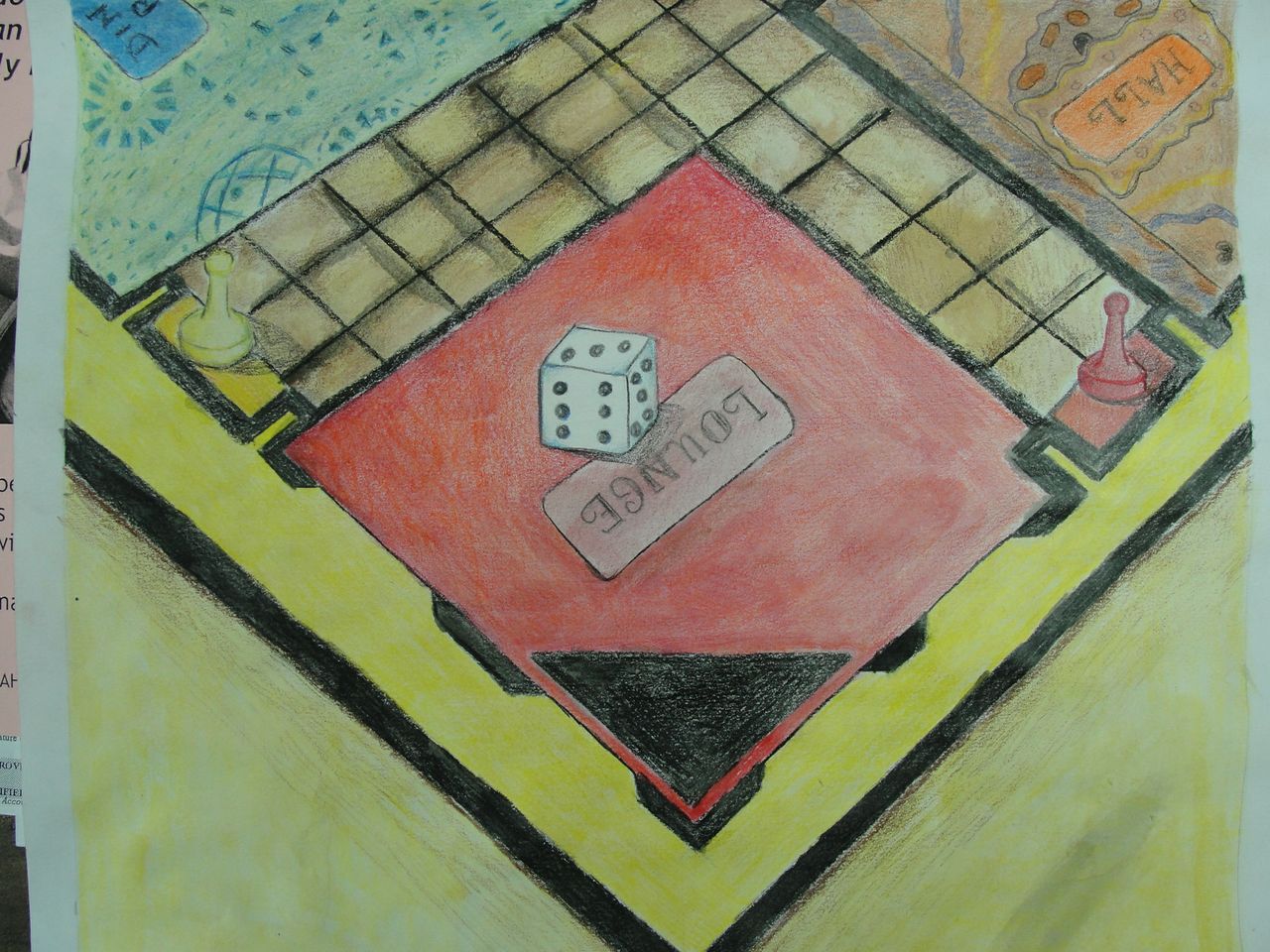
Gameboard Drawing
I think the piece turned out okay from what I expected it to look like in the end. I didn't like the designs on the rooms of the gameboard. They were very difficult to draw and I hated drawing them. I feel okay with this piece. I would haver preffered it too look different and better, but it is okay. I think that the front of the gameboard came out nice, but towards the back it started looking worse. It also looks very unproportional. I would probably try and work harder on my watercolors if I were to do this project again because I didn't like how my watercolors turned out. The most difficult part was drawing it so that it was proportional and also trying to do the watercolors after I drew it. It was hard because I do not really know how to use watercolors. I learned about one point and two point perspective by working on this piece.
Anamorphosis Drawing
I took the picture and brought it into photoshop and made it wider at the top and longer. This created a 3-D perspective. So if the viewer were to look at the photo at a different anlge then it would like like it was sitting on the page. It was also important for me to shade and color in my sketch with colored pencils to make it look more real. I added value so I could also create a shadow. The shadow also made the drawing look like it was standing on top of the page.
Stencil
I changed the photo in the lab by changing the threshold so that there was positive/negtative space throughout the picture. I tried to make the background the colors of nature because my photo was of rocks. I wanted to make the photo be all nature and natural. I used the positive space as the rocks and the shadows of the rocks. Then is used the negative space to represent some of the rocks and the water. As I was using the xacto knife I had to cut away from myself so I would not cut myself. I also had to be very careful and steady with the knife just to ensure of complete safety. There were not that many challenges I had when using the xacto knife though. I enjoyed using the spray paint. I used white so you could still see the nature in the background. I put the stencil in the center because Pillow told me to put it there. Personally I liked it better toward the right though. And I used black spray paint on the stencil to make sure that the landmark was visible.
Subscribe to:
Posts (Atom)